Now you have considered the colours that you would like to share with your audience, let’s look at different ways in which you can incorporate aligned colours into your designs whilst maintaining a professional and recognisable brand image – even if you are using colours outside of your brand palette. (Which you totally can!)
Below are a selection of design style examples to inspire you.

BLACK AND WHITE WITH AN ACCENT.
Using a black and white image with just one element highlighted in your chosen colour can be really eye catching and emotive. Remember you can add in your logo or brand font for the text in order to maintain brand consistency. You could create a whole series of images in this style, helping you to inspire and influence your audience.
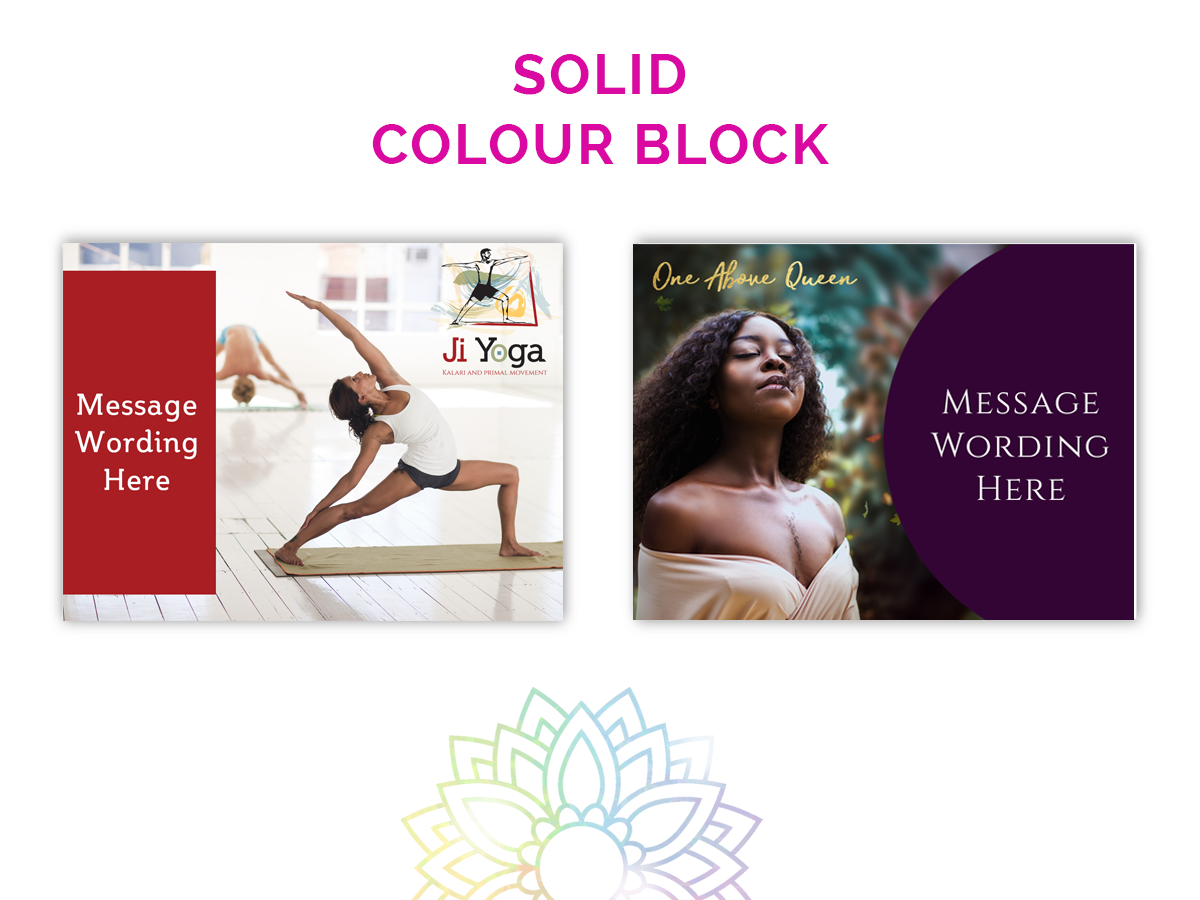
SOLID COLOUR BLOCK.
You could consider adding colour to your design in a block, but remember placement and size of the block you choose will impact how the image is perceived. Make sure you keep clear of any important parts of the photograph when placing your colour and play around with different shapes (rectangles / strips / circles / obtuse shapes – in full or partly overlapping the edge of your image) until you get the effect you desire.
TRANSPARENCY COLOUR BLOCK.
Sometimes a softer colour block will create the energy you want to portray. Consider using a 30 to 70% tint of your chosen colour as an overlay or cut out for your image. This really effects the emotion that a design will evoke and can help you put focus on certain parts of an image.
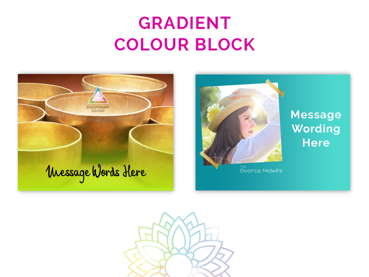
GRADIENT COLOUR BLOCK.
When one colour just isn’t enough – create a gradient colour block to allow portraying extra depth. You could also consider a gradient tint so from 100% colour to 10% colour. These are both great ways to add extra interest and evoke emotion.
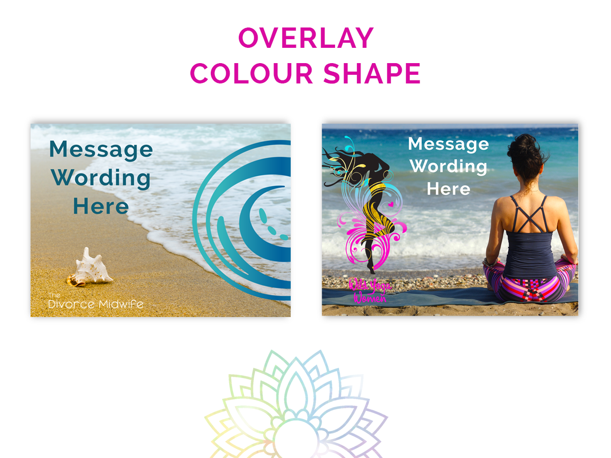
OVERLAY COLOUR SHAPE.
Using overlay colour shapes is a great way to use any brand elements you have to add colour to your designs. If your logo is typographical you can always just choose some shapes that work well in alignment with your brand message.
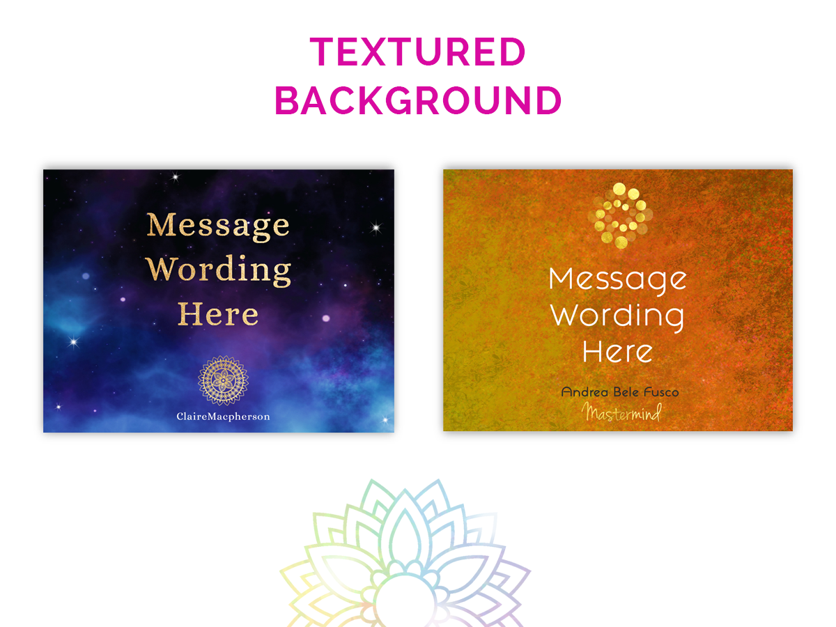
TEXTURED BACKGROUND.
Having a bespoke background with depth of colour and texture is a really fantastic way to make your design feel more tactile and tangible. A background can be very emotive and really draw your audience in far more than using a flat colour block. Backgrounds are very versatile and can be used as templates for adding your own text and photos to. It is worth having a bespoke background that you can modify the colour of to create a series of designs unique to your brand.
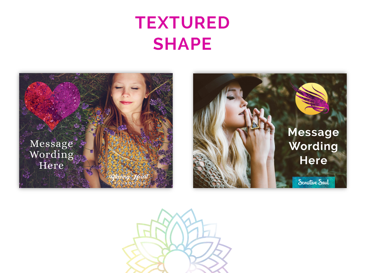
TEXTURED SHAPE.
Once you have created a background you love, you could consider creating some shapes filled with that background. This could be anything from blocks of colour, circles and so on, to icons such as swirls or hearts or other brand relevant visuals.
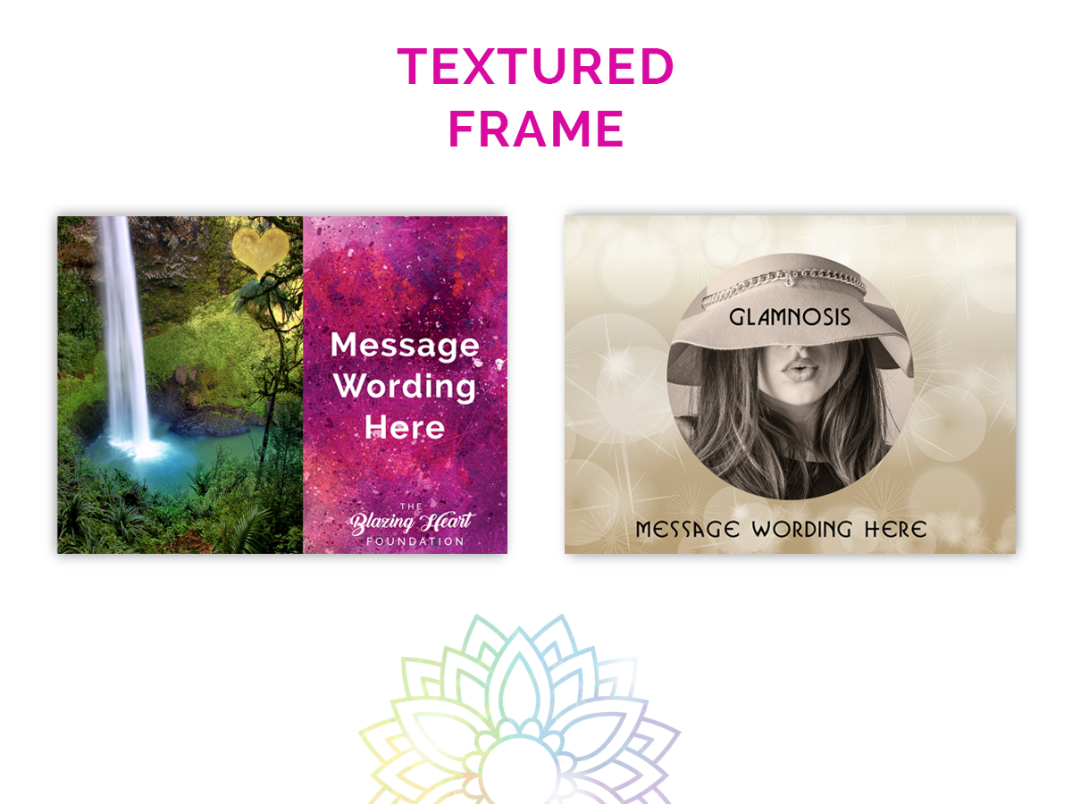
TEXTURED FRAME.
Another way of using your background texture in a versatile way is to create a series of frames that you can add text or images into. Think about versions using a header / footer, a frame that goes all the way round your post, a frame block or semi circle that sits to one side of your post or a circle cut out that you can place text or image inside.

COLOUR SPLASH.
A creative way of adding colour to your image at the moment is using a splash – like a brush stroke shape. This could be in a solid colour or your chosen texture and could be used decoratively or to add text on top of.
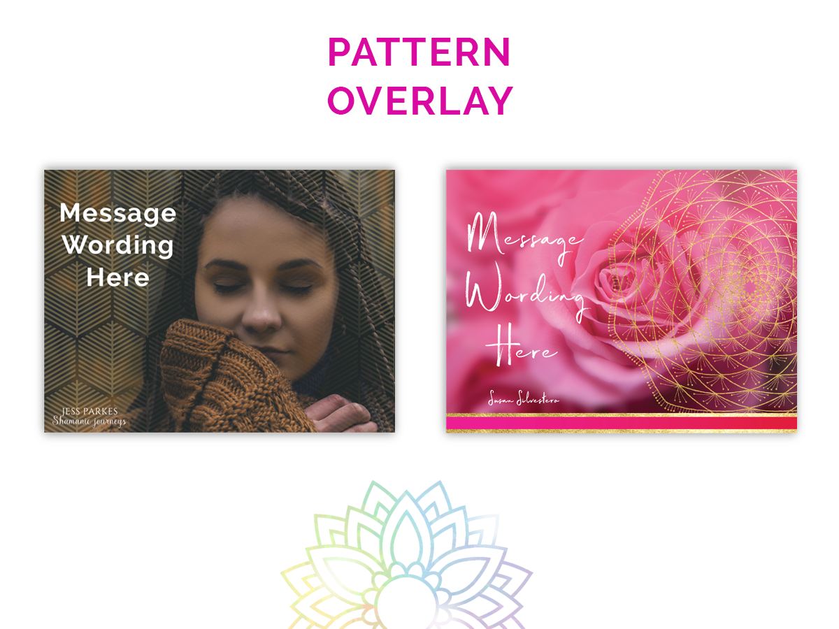
PATTERN OVERLAY.
Another way of adding colour is to use a delicate overlay such as a geometric shape, mandala or other brand relevant pattern. Adding this to your image can infuse it with a rich yet subtle energy shift.
Now it’s time to click on the button below and download your next worksheet. Enjoy!
